Wellian Website by Neda Barbazi |
Home > Winners > #57821 |
 |
|
||||
| DESIGN DETAILS | |||||
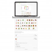
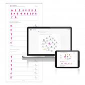
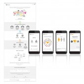
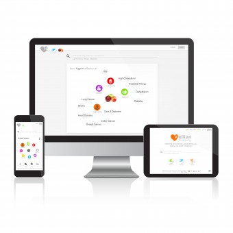
| DESIGN NAME: Wellian PRIMARY FUNCTION: Website INSPIRATION: Project inspiration was frustratingly lack of clear, coherent pathway to remedies. Worse yet, there was an absolute vacuum of any meaningful means of prevention. There are so many fragmented health data online, that we need to bring them into one place and members should be provided with a safe, inviting and engaging environment. That was the motivation to build a wellness preventive platform through integration of data science, human centered design, epidemiological data and human behavior. UNIQUE PROPERTIES / PROJECT DESCRIPTION: The mind map (graph) interface shows interconnectivity of data. The 7 bright, modern, and engaging colors create a happy, nostalgic feeling. The interface is also playable. With a little bit of motion, a more interactive experience is formed to create the sense of excitement and comfort, while reducing anxiety common for visitors of majority of health-related websites. All functions and information are translated into icons to simplify complexity and to break language barrier. OPERATION / FLOW / INTERACTION: On homepage, we instantly see three major compartments: a dashboard to provide all clues about each disease (wellclue); a viewer to show interconnectivity of habitual data, diets, and symptoms (wellview); and an in-development personalization app (wellfolio). In wellclue, by clicking on each symptom or lifestyle habit, we can see all related diseases in wellview. Likewise, from wellview, we can redirect to each related disease. Each color represents a data category such as symptom or treatment. PROJECT DURATION AND LOCATION: 10 months. Vancouver and Bristol. |
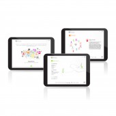
PRODUCTION / REALIZATION TECHNOLOGY: We performed rigorous strategic and scientific research in the ontology expansion of the content and creating the meaningful connectivities. We also conducted research on how people are searching online for health conditions, symptoms, medications, or lifestyle habits. Members had to get the same experience on any device. We utilized a design thinking process along with the latest JavaScript, HTML 5, CSS, and PHP technologies. Majority of icons are SVG vector images. SPECIFICATIONS / TECHNICAL PROPERTIES: Wellian is a fully responsive website that is cross browser compatible. We use IBM Bluemix hosting. We have zero downtime deployment and auto-scaling. TAGS: Website, UI, UX, Design Thinking, Wellness, Digital Health, Graph, Mental Map, Icon, Color RESEARCH ABSTRACT: Scientific and ethnography research methodologies were applied for concept development, human centered design, and product strategy. We utilized data from public domain and literature. We conducted personas, user interviews, and systematic surveys with wide range of demographics as well as user testing of prototypes. Wellian helps members improve their overall wellness through visualizing and simplifying connections between lifestyle, health conditions, symptoms and societal norms. CHALLENGE: Two major challenges for us were to get visitors very quickly to the reliable knowledge in a scientifically challenging topic with so many contradictory information even in the literature; and to make them calm. People are visiting a health or wellness site mainly because they or their loved ones are not in good condition or in pain, hence are not enjoying what they are searching for. Thus, we must satisfy them by providing coherent approach, trustful info, and comfort. ADDED DATE: 2017-04-23 18:34:40 TEAM MEMBERS (2) : Designer: Neda Barbazi and Developer: Kestutis Stalmokas IMAGE CREDITS: Creator Neda Barbazi, Wellian, 2017. PATENTS/COPYRIGHTS: Copyrights belong to NEXSM Inc., 2018. |
||||
| Visit the following page to learn more: http://wellian.com | |||||
| AWARD DETAILS | |
 |
Wellian Website by Neda Barbazi is Winner in Website and Web Design Category, 2017 - 2018.· Press Members: Login or Register to request an exclusive interview with Neda Barbazi. · Click here to register inorder to view the profile and other works by Neda Barbazi. |
| SOCIAL |
| + Add to Likes / Favorites | Send to My Email | Comment | Testimonials | View Press-Release | Press Kit | Translations |

