Insitu Site-Specific Dance Festival Visual Identity by Siri Lindskrog and Jetzt-immer |
Home > Winners > #56888 |
 |
|
||||
| DESIGN DETAILS | |||||
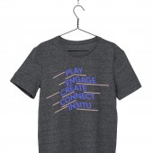
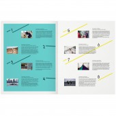
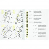
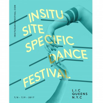
| DESIGN NAME: Insitu Site-Specific Dance Festival PRIMARY FUNCTION: Visual Identity INSPIRATION: The inspiration is the concept and location of the festival. Insitu means "in place" and the concept is to show dance pieces created in relation to specific places at the waterfront in NYC. Therefore the visual identity plays with dimensions in a typographic concept that puts words in a space, relating them to their surroundings. The visual expression is inspired from the modern and playful architecture on the waterfront. The colours are inspired from the water and the summer weather. UNIQUE PROPERTIES / PROJECT DESCRIPTION: The visual identity is build on a versatile and flexible typographic concept, which is being used in various ways across many medias. This concept gives the festival a recognisable, yet variating visual expression. OPERATION / FLOW / INTERACTION: The posters, flyers, website, etc is the public face of the festival and is what creates the users first impression. The design has to look exciting to choreographers, wake curiosity for the residents in the neighbourhood and at the same time look professional and trustworthy. PROJECT DURATION AND LOCATION: The project started in August 2016 and will end in July 2017 after the festival is over. Hopefully the festival will be a yearly event and the visual identity will be expanded and modified for another edition. FITS BEST INTO CATEGORY: Graphics, Illustration and Visual Communication Design |
PRODUCTION / REALIZATION TECHNOLOGY: Most of the print material (posters, flyers, banners, etc) have been printed on white coated paper. SPECIFICATIONS / TECHNICAL PROPERTIES: Posters: A2 (420 x 594 mm) and A3 (297 x 420 mm). TAGS: Dancefestival, eventdesign, dance, festival, design, identity, insitu, graphicdesign, poster, webdesign, printdesign RESEARCH ABSTRACT: I talked to the festival organiser about the core values and concept of the festival. I went to the location of the festival (the waterfront in Queens, NYC) to see the architecture and the environment. I did this to make sure to create a design that supports the values of the festival and i wanted to get inspiration from the visual factors that was already there (like the architecture of the locations). CHALLENGE: It was a challenge to create a design that appeals to the very broad target group of the festival. I had to find the balance point where it's interesting to people who are already very artistically developed, but still approachable for people with less artistic interest. There were many interests involved. ADDED DATE: 2017-03-21 21:37:04 TEAM MEMBERS (1) : IMAGE CREDITS: Siri Lindskrog and Jetzt-immer, 2016. |
||||
| Visit the following page to learn more: http://www.jetzt-immer.com/ | |||||
| AWARD DETAILS | |
 |
Insitu Site-Specific Dance Festival Visual Identity by Siri Lindskrog and Jetzt-Immer is Winner in Graphics, Illustration and Visual Communication Design Category, 2016 - 2017.· Press Members: Login or Register to request an exclusive interview with Siri Lindskrog and Jetzt-immer. · Click here to register inorder to view the profile and other works by Siri Lindskrog and Jetzt-immer. |
| SOCIAL |
| + Add to Likes / Favorites | Send to My Email | Comment | Testimonials | View Press-Release | Press Kit |


