Cure & Care Pharmacy by Kitriniaris and Myroforidou |
Home > Winners > #54830 |
 |
|
||||
| DESIGN DETAILS | |||||
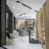
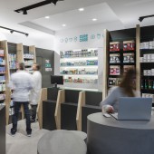
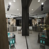
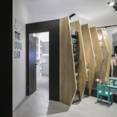
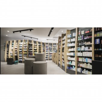
| DESIGN NAME: Cure & Care PRIMARY FUNCTION: Pharmacy INSPIRATION: The inspiration of the pharmacy derives from raw natural materials and especially the custom shelving wood display system is connected to the natural landscape and the forested area of Kryoneri. The name “Kryoneri” is a composite word from the Greek for “cold” (krýo) and “water” (neró), and it is linked to the specific settlement created in 1923 by refugees from Asia Minor. The community’s emblem includes a column in the Ionic style with a pine tree emerging from it. The pine symbolizes the vegetation on Mount Parnitha. UNIQUE PROPERTIES / PROJECT DESCRIPTION: The originality of the design reflects a solid question: How can the visitor take in the whole product display within a few seconds? The wood vertical elements of the custom shelving display, follow a parametric variable curve that is formed by designing a curved visual field for the visitor that relates to the product display as it unfolds. Therefore, the specific method of contextualising the elements targets the whole perception of the visitor, who can rapidly see all the products on display. OPERATION / FLOW / INTERACTION: The objective is to create a functionally unified space, that does not interrupt the overall spatial continuity between the outer, public space of the shopping area and the private workspace of the pharmacists. The design principles have resulted in benefits to the customers. More specifically, the pharmacy clientele has increased, as have the sales of the full product range through the originality of the changing scene design. The time spent in the shop space by customers has also increased, thanks to the immediate functional and visual continuity of the space. PROJECT DURATION AND LOCATION: The project is located in Kryoneri, in the Attica basin, to the north of Athens, Greece. The architectural design started in May 2015 in Athens and finished in September 2015 in Athens. The construction started in September 2015 and finished in November 2015. FITS BEST INTO CATEGORY: Interior Space and Exhibition Design |
PRODUCTION / REALIZATION TECHNOLOGY: The twenty-four unique elements of the custom shelving display system are made of plywood veneer sheets and fabricated with a 3-axis Computer Numerical Control router. The pharmacy floor is covered with waterproof resinous cement to avoid erosion by tinctures and acids, while special layouts for placing medicine drawers that can be reached from the till have also been designed. Likewise, in the laboratory, stainless steel sinks and refrigerators for medicines and vaccines have been used, specific places have been designed to place equipment such as high-accuracy scales, volumetric tubes, magnetic heated baths as well as conical, heat-resistant vials. SPECIFICATIONS / TECHNICAL PROPERTIES: Overall Interior Space Area: 80,00m2, Main Pharmacy Store Area: 50,00m2, Laboratory Area: 10,00m2 , Storeroom Area: 5,00m2, Washrooms & Beauty Cabin Area: 5,00m2, Till and Medicine Drawers Area: 10,00m2. Interior Height to Concrete Ceiling: 3,60m - Interior Height to Gypsum Fibreboard Ceiling: 3,00m. TAGS: Pharmacy, Cure & Care, Custom Shelving Display System, 3-axis CNC Router, Parametric Design, Wood Structure, Led Spotlights, Laboratory, Medicine Drawers, Storeroom. RESEARCH ABSTRACT: The gradual transition, or notional, predetermined path is transformed into a variable spatial experience, on the one hand composing the vertical level of the outer facade as a boundary between the public and the common space, and on the other, the vertical level of the scene as a boundary between the common space and the private areas of the pharmacy. Lastly, the extensive transparency of the fourteen-meter facade functions as a display for the interior of the pharmacy towards the exterior public surrounding area. CHALLENGE: The main challenge is to completely renovate an empty interior space into a pharmacy store. The primary intention is to create a changing scene, where as each element is contextualised, together they direct the eye and the visitor's movement along the product display of the pharmacy store. The scene is linearly developed as a changing, continual system that functions as a perceptual boundary between the private and public spaces. Thus, the scene simultaneously separates and unites the laboratory, the storeroom, and the washrooms with the main space of the pharmacy shopping area. ADDED DATE: 2017-02-24 17:07:44 TEAM MEMBERS (3) : KAAF Architects, Alexandros Kitriniaris and Verina Myroforidou IMAGE CREDITS: All Images belong to KAAF Architects and George Messaritakis, 2017 PATENTS/COPYRIGHTS: Copyrights belong to KAAF Architects, 2017 |
||||
| Visit the following page to learn more: http://www.kaaf.gr | |||||
| AWARD DETAILS | |
 |
Cure & Care Pharmacy by Kitriniaris and Myroforidou is Winner in Interior Space and Exhibition Design Category, 2016 - 2017.· Press Members: Login or Register to request an exclusive interview with Kitriniaris and Myroforidou. · Click here to register inorder to view the profile and other works by Kitriniaris and Myroforidou. |
| SOCIAL |
| + Add to Likes / Favorites | Send to My Email | Comment | Testimonials | View Press-Release | Press Kit |

