Aquila Hematology Analyzer Hematology Analyzer by Maform Design Studio |
Home > Winners > #49375 |
 |
|
||||
| DESIGN DETAILS | |||||
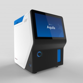
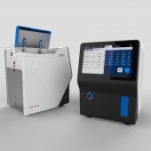
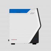
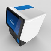
| DESIGN NAME: Aquila Hematology Analyzer PRIMARY FUNCTION: Hematology Analyzer INSPIRATION: The main source of inspiration was the absolute functionality of the object. It had to comply with extreme usage and to be simple enough to be handled by inexperienced laboratory workers. Some of the innovations of Aquila are the reduced size and the simplified testing process. These were the key inspiration sources throughout the design process. UNIQUE PROPERTIES / PROJECT DESCRIPTION: Aquila is an innovative hematology analyzer as it has the potential to change clinical practice and patient care leading to reduced healthcare costs and waiting times. Because of its small size it can free up the desk spaces in offices and it's easily transportable and can be used in any testing scenario. Aquila offers the optimal solution even for the inexperienced users. The Aquila has an external appearance which is simple and functional while retaining a characteristic look and feel. OPERATION / FLOW / INTERACTION: The sample tube is inserted through the front lid and then processed by the machine automatically. The results are shown on the tilted touch screen. The setup and the fine tuning of the test all can be controlled through the user-friendly graphic user interface. To make the process even easier, specific functions can be assigned to different user profiles. Maintenance, reagent pack changing and service are easily manageable by removing the enclosure. PROJECT DURATION AND LOCATION: The project started in Q2 2013 in Budapest and finished in Q2 2016 in Budapest. FITS BEST INTO CATEGORY: Medical Devices and Medical Equipment Design |
PRODUCTION / REALIZATION TECHNOLOGY: Aquila is made of custom made metal, sheet metal and plastic parts. The enclosures are fabricated with moulded plastic. We designed the device to be manufactured with colored materials for injection moulding for extra durability. SPECIFICATIONS / TECHNICAL PROPERTIES: 322mm x 272 mm x 366 mm TAGS: lifescience, healthcare, medical, hematology, health, doctor, hospital, blood, RESEARCH ABSTRACT: Our objective was to design a solution (in the form of a medical equipment) that makes blood testing quicker and more accessible. During the research phase we used the following tools: user research, user scenario modeling, mock-ups, physical prototypes, and user tests. We have conducted a user research with practicing doctors and medical assistants in order to get feedback about user flows and drawbacks of current solutions. After evaluation, we had set up a criteria which were later used to evaluate the many options we have created in the design phase. CHALLENGE: In the field of hematology (and medical equipment in general) users are used to outdated and complex user interfaces and operating flows. These are usually dressed up in less outdated graphics. Our goal as designers was to redefine the very basics of interaction in hematology devices. As a challenge, we had to fit new technology with some traditional solutions (in terms of operational parts and medical standards) and create an enclosure that communicates our innovation to users. ADDED DATE: 2016-06-29 13:19:22 TEAM MEMBERS (1) : Maform Design Team IMAGE CREDITS: Maform Design Team |
||||
| Visit the following page to learn more: http://bit.ly/2a24ctQ | |||||
| AWARD DETAILS | |
 |
Aquila Hematology Analyzer Hematology Analyzer by Maform Design Studio is Winner in Medical Devices and Medical Equipment Design Category, 2016 - 2017.· Press Members: Login or Register to request an exclusive interview with Maform Design Studio. · Click here to register inorder to view the profile and other works by Maform Design Studio. |
| SOCIAL |
| + Add to Likes / Favorites | Send to My Email | Comment | Testimonials | View Press-Release | Press Kit |


