40 Kreattiv Magazine Covers Editorial by Andrew Carter |
Home > Winners > #45888 |
 |
|
||||
| DESIGN DETAILS | |||||
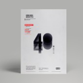
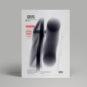
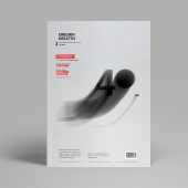
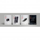
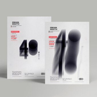
| DESIGN NAME: 40 Kreattiv Magazine Covers PRIMARY FUNCTION: Editorial INSPIRATION: I was inspired after reading a study about a technique known as chronophotography which captures movement in several frames. It was discovered in the Victorian era (1867-68), which was also carried out 10 years later by Eadweard Muyridge who displayed the first lead of motion pictures. This study resonated with me and inspired me to create the identity of 40 dynamic creative people. Etienne-Jules Marey who also made use of this technique in his works, was also one of the main inspirations. UNIQUE PROPERTIES / PROJECT DESCRIPTION: The main idea of the identity was to produce a look of action to express contemporary art through the motion of the logo. The different arrangements of the logo creates a sense of motion by blurred forms, and textures that cause the eye to move over the work. With the help of different experiments conducted in a photography studio, a photography technique known as 'chornophotogra OPERATION / FLOW / INTERACTION: The logo communicates well with the audience, even those who don't know much about the community which is made up of 40 people. The motion within the logo makes the static covers alive. PROJECT DURATION AND LOCATION: The project started in March 2014 in Malta and finished in May 2014. FITS BEST INTO CATEGORY: Graphics, Illustration and Visual Communication Design |
PRODUCTION / REALIZATION TECHNOLOGY: Throughout the investigation different research areas related to type in motion were carried out. Different materials, software, and mediums were used throughout the whole design process. Since the aim was to achieve a motion effect, playing with the shutter speed was necessary. By playing with the aperture and shutter speed settings, the right amount of exposure was achieved. The final outcome enables advertisements and book covers to be more original and visually appealing. SPECIFICATIONS / TECHNICAL PROPERTIES: Covers: Width:210mm Height:297 mm TAGS: editorial, covers, graphic design, photography, logo RESEARCH ABSTRACT: The main purpose of the research was to study type in relation to motion. Originality and creating effective concepts for advertisements is an area that needs lots of investigation. Investigation took place by conducting different research experiments and studies in regards to the technique invented in the 1867 known as chronophotoghraphy. The products of this study includes areas related to typography legibility, typography application, and motion. CHALLENGE: The biggest challenge was to express a strong perception of the creative community simply through the logo and the covers layout. It is evident that typography is evolving and changing rapidly as time goes by, so it was challenging to come up with an editorial cover concept that stands out from other work. Also, I took inconsideration that the rate of new typefaces being produced nowadays is simply staggering, so a detailed research had to be done. ADDED DATE: 2016-02-22 20:33:22 TEAM MEMBERS (1) : IMAGE CREDITS: Image #1: Creator (Graphic Designer), Andrew Carter, 2014 Image #2: Creator (Graphic Designer), Andrew Carter, 2014 Image #3: Creator (Graphic Designer), Andrew Carter, 2014 Image #4: Creator (Graphic Designer), Andrew Carter, 2014 Image #5: Creator (Graphic Designer), Andrew Carter, 2014 |
||||
| Visit the following page to learn more: http://bit.ly/1W97qOS | |||||
| AWARD DETAILS | |
 |
40 Kreattiv Magazine Covers Editorial by Andrew Carter is Winner in Graphics, Illustration and Visual Communication Design Category, 2015 - 2016.· Press Members: Login or Register to request an exclusive interview with Andrew Carter . · Click here to register inorder to view the profile and other works by Andrew Carter . |
| SOCIAL |
| + Add to Likes / Favorites | Send to My Email | Comment | Testimonials | View Press-Release | Press Kit |

