| THE AWARD |
| CATEGORIES |
| REGISTRATION |
| SUBMIT YOUR WORK |
| ENTRY INSTRUCTIONS |
| TERMS & CONDITIONS |
| PUBLICATIONS |
| DATES & FEES |
| METHODOLOGY |
| CONTACT |
| WINNERS |
| PRESS ROOM |
| GET INVOLVED |
| DESIGN PRIZE |
| DESIGN STORE |
| THE AWARD | JURY | CATEGORIES | REGISTRATION | PRESS | WINNERS | PUBLICATIONS | ENTRY INSTRUCTIONS |
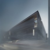
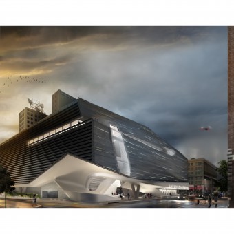
Grey Matter Children's Museum by Martin Summers |
Home > Winners > Design #47555 >Interview |
 |
|
FS: What are your future plans for this award winning design?
MS: Publication and further award applications
FS: How long did it take you to design this particular concept?
MS: The initial competition took around four weeks but was not to the level that I knew the project could be. We went back a few months later and worked for another 8 weeks to produce the award-winning project.
FS: Why did you design this particular concept? Was this design commissioned or did you decide to pursuit an inspiration?
MS: There was an international ideas competition with a site located close to home. The program contained very precise requirements in terms of the urban context and masterplan while remaining loose enough that the competition expected experimentation and new ideas.
FS: Is your design being produced or used by another company, or do you plan to sell or lease the production rights or do you intent to produce your work yourself?
MS: no
FS: Where there any other designs and/or designers that helped the influence the design of your work?
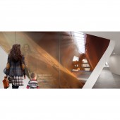
MS: We looked at the Perot Museum of Nature and Science by Morphosis Architects, the last project I worked on at Morphosis. In particular, we looked at the atrium sequence that I designed and how this circulation related to the programming and overall museum experience. We also used the idea in this project to start at the top and descend which borrowed from historical precedents like the Centre Pompidou in Paris or the Guggenheim New York before that. By arriving at the top and descending, it allowed for the ramps and museum to be experienced through a leisurely walk where ones focus is on the exhibits and spaces and not on the length or effort of movement.
FS: How did you come up with the name for this design? What does it mean?
MS: Grey Matter attempts to describe both the process and the ideas of the project. It is a project that is conceptually layered requiring an intensive investigation in both the design process and ideally in someone who would experience its constructed reality. The name also points toward the goal of the museum as an institutional construct to support the education and development of children and their knowledge of the world around them. Therefore, the museum is a response to and an extension of this institutional mission.
FS: Which design tools did you use when you were working on this project?
MS: Rhino, Grasshopper, Adobe Suite
FS: What is the most unique aspect of your design?
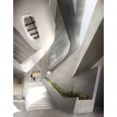
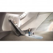
MS: The open public space that is the entry and circulation sequence to the ticketing counter is accessible at all hours free of charge. This same space provides an intensified, urban, spatial experience that links visitors to the museum as an institution and the institution to the city and neighborhood. The public space makes up about 25% of the building volume and is naturally ventilated through the various seasonal cycles, connecting the inside to the context in a direct way, linking the city street level to the fourth-floor observation deck which looks back toward the pocket park and exterior programmed space of the museum.
FS: Who did you collaborate with for this design? Did you work with people with technical / specialized skills?
MS: Hans Koesters, s student of mine at the time.
FS: What is the role of technology in this particular design?
MS: It is significant in both the digital tools that allowed for an intensive investigation of the problem and its potentials and conceptual in that the technology of construction and science is an educational opportunity in this program. It both drives the design process and is expressed in the design itself.
FS: What are some of the challenges you faced during the design/realization of your concept?
MS: The project required that all levels be connected via the Americans with Disabilities Act (ADA) ramps that are controlled by code requirements for slope and level change. With the floor-to-floor height of a museum space, the requirement for ramping forced a novel solution to stagger the height of the floors from north to south, increasing the number of ramps overall while reducing the length of any individual ramp. This strategy was then spatialized by varying the experience as one moves from ramp to ramp so that the ramps are not a conscious focus of the occupants, but empower an exciting and dynamic experience.
FS: How did you decide to submit your design to an international design competition?
MS: I wanted to test out some evolving ideas against a design brief that had consequences and to see how those ideas measured up to the competition.
FS: What did you learn or how did you improve yourself during the designing of this work?
MS: I grew in confidence with regard to my direction as a designer, my abilities to solve complex problems while adding value, and in my abilities to lead others through this process.
FS: Thank you for providing us with this opportunity to interview you.
A' Design Award and Competitions grants rights to press members and bloggers to use parts of this interview. This interview is provided as it is; DesignPRWire and A' Design Award and Competitions cannot be held responsible for the answers given by participating designers.
| SOCIAL |
| + Add to Likes / Favorites | Send to My Email | Comment | View Press-Release |
