| THE AWARD |
| CATEGORIES |
| REGISTRATION |
| SUBMIT YOUR WORK |
| ENTRY INSTRUCTIONS |
| TERMS & CONDITIONS |
| PUBLICATIONS |
| DATES & FEES |
| METHODOLOGY |
| CONTACT |
| WINNERS |
| PRESS ROOM |
| GET INVOLVED |
| DESIGN PRIZE |
| DESIGN STORE |
| THE AWARD | JURY | CATEGORIES | REGISTRATION | PRESS | WINNERS | PUBLICATIONS | ENTRY INSTRUCTIONS |
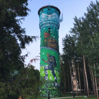
Wisdom Path Climbing Tower by Dmitry Kudinov |
Home > Winners > Design #100537 >Interview |
 |
|
FS: What is the main principle, idea and inspiration behind your design?
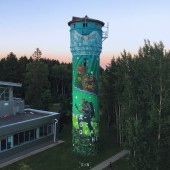
DK: Initial inspiration came from the object, its shape. I am talking about the water tower which was supposed either to be reconstructed (practical application was unknown) or renovated because it has lost its direct function long ago, but it still dominated the area. The initiative came from the Rector of Senezh Management Workhop, and our task was to do something with the object.
FS: What has been your main focus in designing this work? Especially what did you want to achieve?
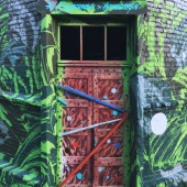
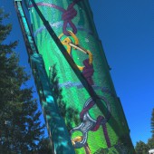
DK: It turned out that the cylindric shape of the object was very complicated for a composition. We had several examples of our foreign colleagues but the approach there was a little bit different and there was their own style. Therefore, we had to reinvent how to work with it. There were difficulties. The main starting point was the environment itself. The object was surrounded by a large forest and a beautiful lake. The task was to reflect a topic of climbing up. As a pattern we took Elbrus (the highest mountain in Russia, 5642 m). The context itself gave us a tip – movement from the ground to the sky. It is shown in the gradient – transition from green to blue. And the story here is about becoming a professional. It does not matter what you do, these are the social lifts which you take spirally. The object itself had a spiral staircase some time ago for climbing upstairs. That was also taken as a basis for the composition and the plot. The reverse plot with the hooks was based on another idea – support provided by Senezh Workshop to its students. Since we often work with industrial climbers, we know their aesthetics and culture. These guys are special kind of people, many of them climbed to Elbrus. We also wanted to pay certain respect to their work because they give us a lot of support being responsible for our safety. These two kinds of support (support by the Workshop and support provided to us) were reflected in these connected hooks.
FS: What are your future plans for this award winning design?
DK: Our job is done there but we keep monitoring what is going on there. The Workshop Rector will make this tower a climbing wall. This will be the primary function, and everybody who is accommodated at the venue can try it. Balconies and tips are already in place. These are the existing infrastructure elements, the small balconies used for cellular communication before but not anymore. They will be used for safety ropes. The second function is the completion stage for the students. You cannot call it a gala concert, there will be some kind of a prom. The spiral staircase will be reinstalled within the tower. There will be a view on the lake, the forest and the whole territory of the Workshop from the windows. It is a very picturesque location. This symbolical climbing of the students will occur once they complete their studies. Maybe they will throw something in the air. It is very interesting to watch what is going on without our participation.
FS: How long did it take you to design this particular concept?
DK: Development of both technical aspects and the concept took about a month including approval of documentation. There were sketches ready when we arrived at the object. It took us several days to implement the key plot. The reverse plot took literally one evening. We were already deep in the context. There was a direct dialogue which allowed us to react promptly. It was really quick – three days for the key plot and one evening for the reverse plot.
FS: Why did you design this particular concept? Was this design commissioned or did you decide to pursuit an inspiration?
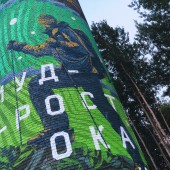
DK: I have already said above, this was the result of joint brainstorming. This is the owner’s territory, therefore we should take his wishes into consideration. There was nothing like moderation, the trust level was extremely high. That is why we made some minor changes but we tried to achieve the acceptable result. There were some raw issues and we realized that they would not work at this scale and cylindric shape. We have not even shown some of our concepts to the owners because it made no sense – these concepts were too raw. While collecting information we came to this final concept. The idea is ours, concept description is ours. I can point out that when I made my presentation of the project, I briefly presented the concept description. There was a quote: wisdom is experience in stone. This has become the foundation, literally and figuratively, as a plot basis. It was liked a lot that is why this quote appeared in the lower part of the tower and is not visible from the first glance.
FS: Is your design being produced or used by another company, or do you plan to sell or lease the production rights or do you intent to produce your work yourself?
DK: The object itself was out of our jurisdiction therefore we realized that we were doing it for someone else. But the author project stays the author project. Our projects are spread around various cities and locations, that is why you always know that you may never come back to this location. But you can monitor the process through social media and the Internet. For instance, when we were awarded with silver award, I shared this information with the Rector. I do not know how they publicized it, but I started getting messages from people who worked there before saying that ‘we won’. So, it is not only me but also people involved in this project who keep monitoring it and support this whole story as their own personal experience.
FS: What made you design this particular type of work?
DK: It is difficult to say, we had a request and we had to work on it. It was not initiated by us. It was challenging to work with such format because this was a very interesting object, definitely not typical and not a standard one. That was very interesting
FS: Where there any other designs and/or designers that helped the influence the design of your work?
DK: There was certain influence, but rather indirect. Getting deeper into the context had much more influence. There were no direct references. We got it together from scratch basing on technical specifications, limiting and moderating ourselves. Self-criticism is an important element. When we had a dialogue with owners and other people, we had this influence. They were the carriers of more unique information, they knew more and they produced these triggers. In fact, neither the references nor other designers works played a role here.
FS: Who is the target customer for his design?
DK: The target audience are the students who will study at the Management Workshop. As far as I know, they are managers. The task of the Workshop is to carry the message about the social lifts and certain growth. Since the territory is quite big, there are also people living in a neighboring small town because the tower is visible from outside the territory. So, there is the direct and indirect target audience.
FS: What sets this design apart from other similar or resembling concepts?
DK: First difference is the format itself. The cylindrical tower which is rarely an object worldwide. We tried to look for some references and other people experience. We managed to find only 2-3 good examples which were impressive enough. We wanted to work with such format. Second, the initiative of the owners because we could not have done without their trust and their initiative. The tower may have been destroyed completely and maybe that was more sound financially for the owners. But they chose a path of renovation of existing infrastructure elements. Before the whole territory was in a miserable condition. Investment was desperately required, and they managed to source these investments and the territory started to change rapidly. Some major events started to be held. And they attracted certain attention.
FS: How did you come up with the name for this design? What does it mean?
DK: I have already briefly said about that. This is really quite interesting because there was a visual concept and a cloud of tags and meanings which needed to be worked on. The concept description required to have a concentrated idea. While describing this project I realized that there is experience accumulated over years and this ascending movement and social lifts are related to a person growing up. And experience transforms into wisdom. Sometimes they say: he is too wise for his age. It takes time to gain this experience. If you relate it to mountains and landscapes in general this higher density of the ground and formation of the mountains represent this experience gained over years, layer by layer. All these components, all triggers that were obvious resulted in this quintessence phrase saying that wisdom is experience in stone. Initially I did not point it out. Originally, we produced the English phrase ‘wisdom path’ also being a reflection of the same thing. Essentially, we came to understanding that this is a concentrate of meanings which I think reflect the whole idea of the project.
FS: Which design tools did you use when you were working on this project?
DK: I already said before that I consider graphic design to be a tool for visualization. We assembled the picture from separate elements. We realized that we had quite a simple sketch, and we needed skills to move it to the larger format and scale. Designer’s tool set allows you to understand certain issues. But every time you have to go through technical criteria: what and how will be implemented? For instance, we have this spiral going which divides characters and plots into fragments. Since this spiral goes around, we needed to calculate brick by brick how big should be the interval, how many elements we should take. It was not clear on the sketch. Later on, we projected all this on the building facade. That provided us with solution for some specific features of the project. Since the tower is cylindric, there were issues to be adjusted during the implementation process. Generally, these tools were represented by graphic editors and most of the work was done by hands. There were no extra elements except for projecting using a projector.
FS: What is the most unique aspect of your design?
DK: I think that the most unique aspect of this project is trust. Nobody controlled us, we had deadlines and we understood how to structure our work. There were short visits by the owners, but they were of a sightseeing tours type. There were guests, high-rank officials who were told about what was supposed to be there. The owner being impressed by the concept did not make any attempts to interfere. He was just monitoring the process and told people what would be implemented there. Through our work we realized that people are interested in processes, too, not only the final result.
FS: Who did you collaborate with for this design? Did you work with people with technical / specialized skills?
DK: We collaborated directly with our client. The project was initiated by Mr. Alexei Kasprzhak, the Rector of Senezh Management Workshop. We had a team of industrial climbers dealing with technical issues, including surface cleaning and preparation, priming and painting of the gradient. They did it quickly and professionally. Later on, they were responsible for safety measures when working at heights. And there were 3 people responsible for production being me as an author, Kirill Oshestin responsible for working on the ground and my father, Sergei Kudinov assisting with technical aspects and painting works. He was also monitoring the materials and was responsible for their delivery. That was this small team that implemented this project.
FS: What is the role of technology in this particular design?
DK: Technology was presented in two aspects: transmission of an image at a large scale using the projector but that was not perfect due to cylindric shape. So, we needed to make corrections taken the shape. The second aspect was special equipment and industrial climbers. Working at heights requires experience and responsibility for yourself and your team. This is very important, therefore people having special skills had their own area of responsibility. There were also truck-mounted aerial devices which needed to be operated. This is the minor part of technology utilized in this project. If it is transformed into a climbing wall later, some extra elements will be required to be working after us.
FS: Is your design influenced by data or analytical research in any way? What kind of research did you conduct for making this design?
DK: Many issues here were connected to related areas. We do not implement any project without prior analytical work. You cannot have inspiration from nothing. You need initial data. You need to understand the context and cultural codes: where it is located, how it will be used, how people will see it. As a minimum: the tower is located between the building and the forest. The tower windows located on the sides of the tower face these elements. Technically it gave us a tip that it made no sense to show the slots on the sides. We had the front part well visible from the entrance and the reverse side visible from the lake. There are footpaths from the lake and people who return from the lake may see the reverse side. It is very important indeed to collect technical data, analytical and mental data. This represents part of our work, a very important element of it.
FS: What are some of the challenges you faced during the design/realization of your concept?
DK: The most unexpected challenge was the tower’s shape, a cylinder where we had to locate our composition and transfer it technically. The bricks helped us being some sort of a net providing parameters. And it was extremely hot when we were working. We had to start very early in the morning to avoid heat. In the afternoon the sunlight was at the frontal part where we did most of our work. You have to be extremely careful when it is hot. You lose your concentration, you get tired much faster. Being close to the lake and the forest helped a lot, walks in the evening brought us back to our senses.
FS: How did you decide to submit your design to an international design competition?
DK: This was our first experience of applying for a competition ever, and this one also being an international one. We present our portfolio at Behance platform. We understand that the professional community monitors this platform very closely. It provides very good feedback. You get into certain topics and publications and you are granted with badges. For instance, this work was granted with a badge within Illustration category, Street Art sub-category. It was not our first project presented there but it looks like some of the Award managers noticed it and wrote us a letter offering participation. At that time this project has not been published and they offered us to present other works for a competition. And we have decided to concentrate on the tower, among others. Maybe we don’t have enough time to follow major international competitions. So far, we do not understand what we should expect from these results. We desperately want to communicate more with our foreign colleagues and work more in foreign countries. It is interesting to know the approaches to such projects. Having surfed through the winners list I realized that every year super professionals participate in this competition and they have numerous nominations and awards.
FS: What did you learn or how did you improve yourself during the designing of this work?
DK: This is just the confirmation of our experience: you need to treat your project consciously. You cannot do any work without connecting it to the context and functionality. You need to take a lot of elements into consideration: how it will be utilized, who will use it, how important is your work. For many people, culture and design are ephemeral products without any physical element and difficult to touch. As I said before, good design should not be visible. This relates mostly to consumer products and their use. Our function is to transform certain objects. For instance, there is this tower. If it disappears at a certain moment, many people will not notice that. But if this tower becomes an artistic object, then it becomes a bright dominating element. Brightness is not the best criteria. I mean that we have to transform it to an element having certain meaning. It has some meaning in the first place.
FS: Any other things you would like to cover that have not been covered in these questions?
DK: It is always interesting to watch the destiny of your works. And if you follow it for years there are people finding out that this is your work, and their attitude becomes more positive. They start treating you as a long-time friend, especially if they saw your work live. The person may not know you personally, but a person saw it on the Internet, the attitude changes. I had such situation: a person I know visited the Management Workshop as a speaker. I needed to talk to him on the phone. He texted me: I am here in Solnechnogorsk. I asked, whether he is at Senezh Management Workshop by any chance? He said ‘yes’. I told him that he would see our objects there, the entrance, the Tower. He said that he noticed them and that it was cool to know that these are your objects. And he was happy to find out, it is great when the people you know see your works live.
FS: Thank you for providing us with this opportunity to interview you.
A' Design Award and Competitions grants rights to press members and bloggers to use parts of this interview. This interview is provided as it is; DesignPRWire and A' Design Award and Competitions cannot be held responsible for the answers given by participating designers.
| SOCIAL |
| + Add to Likes / Favorites | Send to My Email | Comment | View Press-Release | Translations |
